Generated with Avocode.frameplay
Close project

Interactive AR Product Experience

An Interface Design Exploration for Product Experiences in AR


2019 was the year of AR. Probably 2020 will be the year of the AR too and every year for the next decade or so. But since having worked in the AR space for a few years now, we felt the need to push the envelop when it comes to AR product experiences, even though we get to work on a lot of fun projects in collaboration with our partner agencies or directly with brands. But we had a few ideas we wanted to explore around interactive product experiences and from a spatial design perspective, moving away from the square images of products we see online stores.

So we ideated on how consumers would like to engage with products digitally, now that gradually the rectangular bounding box of the screen is falling apart & spatial design is replacing it. We zeroed in on 2 approaches to this-one would be a visually immersive experience & other would be a functionally engaging one. We built and publish two AR experiences to test out the results of our brainstorming sessions, but we also selected two very culturally relevant products that consumers can instantly relate to and engages them at the first sight, even in this relatively new medium.


A famous power-drill

For the functionally engaging experience we choose the Dewalt Hammer Drill, arguably an instantly recognisable power tool. Also as there are numerous features and functionalities within a power drill that’s hard to convey through photos and even if How-To videos help somewhat, it distances the user from the product. But an AR experience would essentially let users have a more “hands-on” trial. And we have the belief that’ll influence a giant leap in engagement for such brands at all online/digital POCs.


But first, lemme make a model!

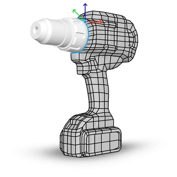
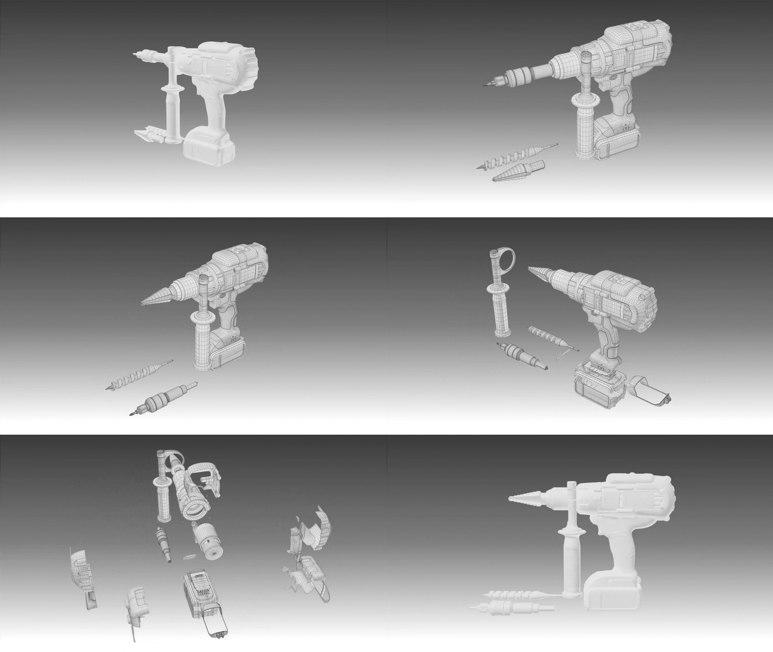
Before we can move into the UX and think about how users will interact with the whole experience, we needed to build out the content, in this case the 3D model of the drill. And this is probably the most time-consuming and artistically challenging part of building an AR experience. The 3D model must perfectly represent the actual product with all of its details, the materials its made up of like wood, metal, plastic and represent everything in 3D as close to real-life as possible. And all of this takes some time, depending on the structural complexity of each object. No way to rush it.


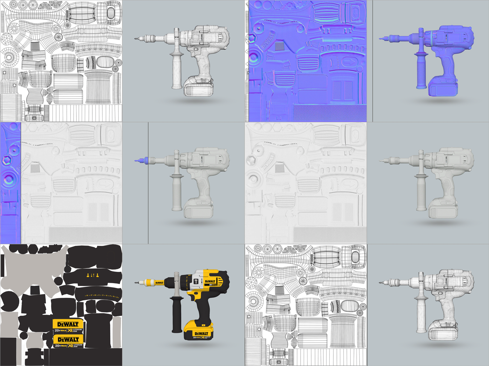
Under the hood, this is what a real-time 3D asset looks like. All these layers add visual fidelity & realism to an asset.

Exploring UI/UX for Spatial experiences


The whole conversation is out-of-the-box or rather out-of-the-screen when it comes to UI/UX design for spatial experiences. Since there are no bounding edges of a rectangular screen to limit the interface between users and the tech. We were free to explore how we can borrow the pre-existing standards of intuitive interfaces and implement them using the infinite possibilities that designing interfaces layered on the real world affords.


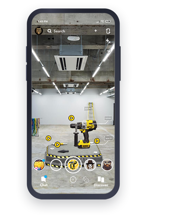
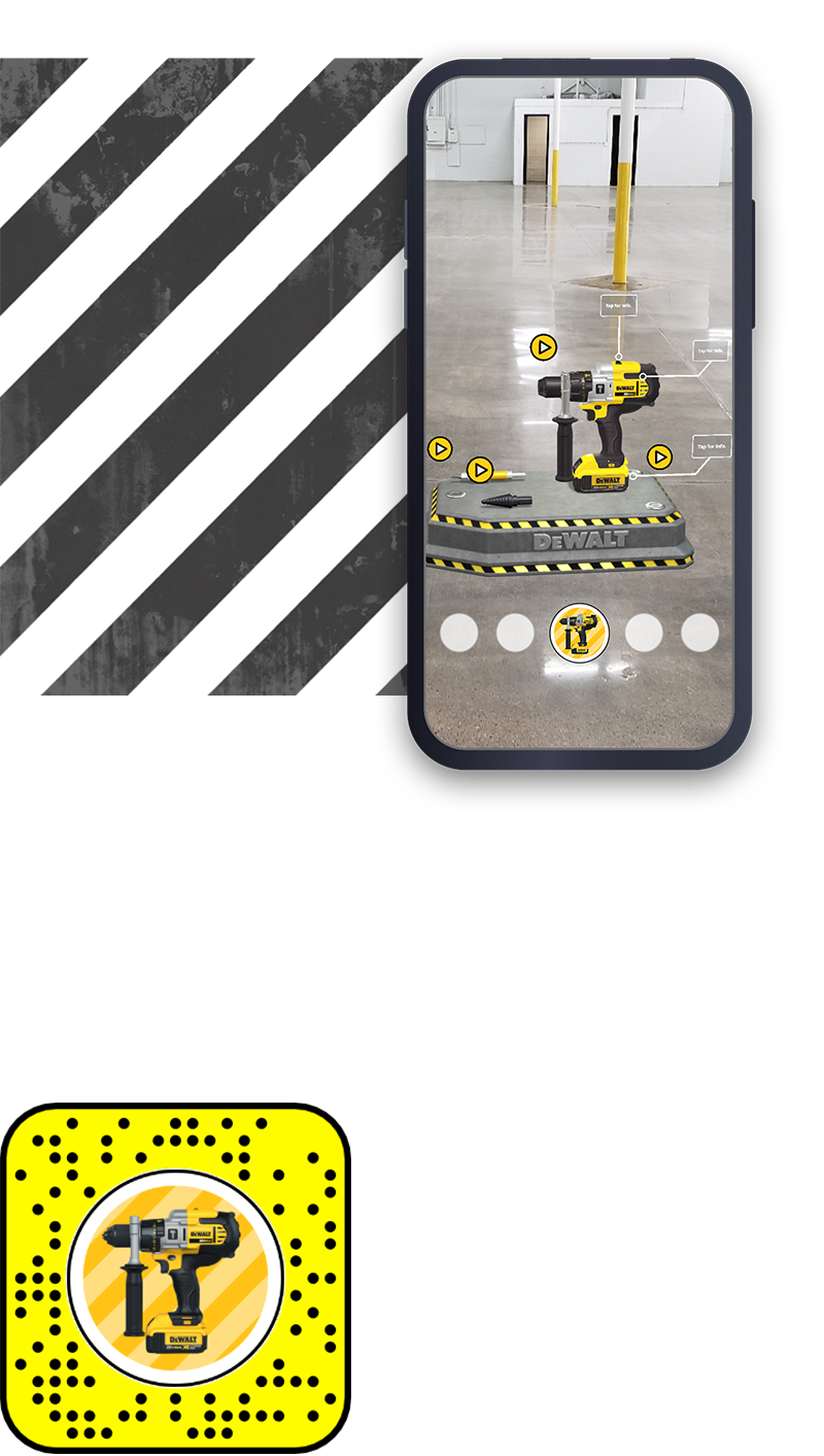
Like almost everyone who’s familiar with using digital interfaces knows what the play button does, but we built it into the experience in a way that indicates there is specific content that can be played connected to certain points on the product. We also had text cards pointing to certain sections on the product which when tapped on would reveal some technical information, akin to the read more options in traditional screen interfaces.

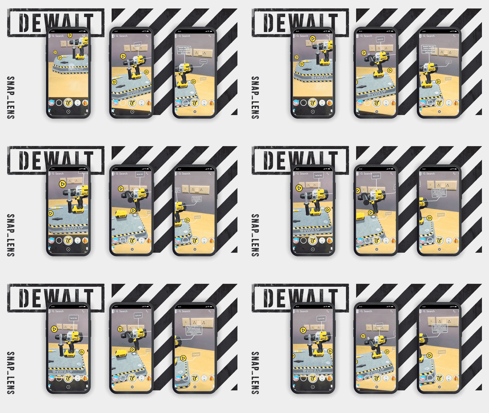
 

Spatial Interfaces

Lens Studio setup & build

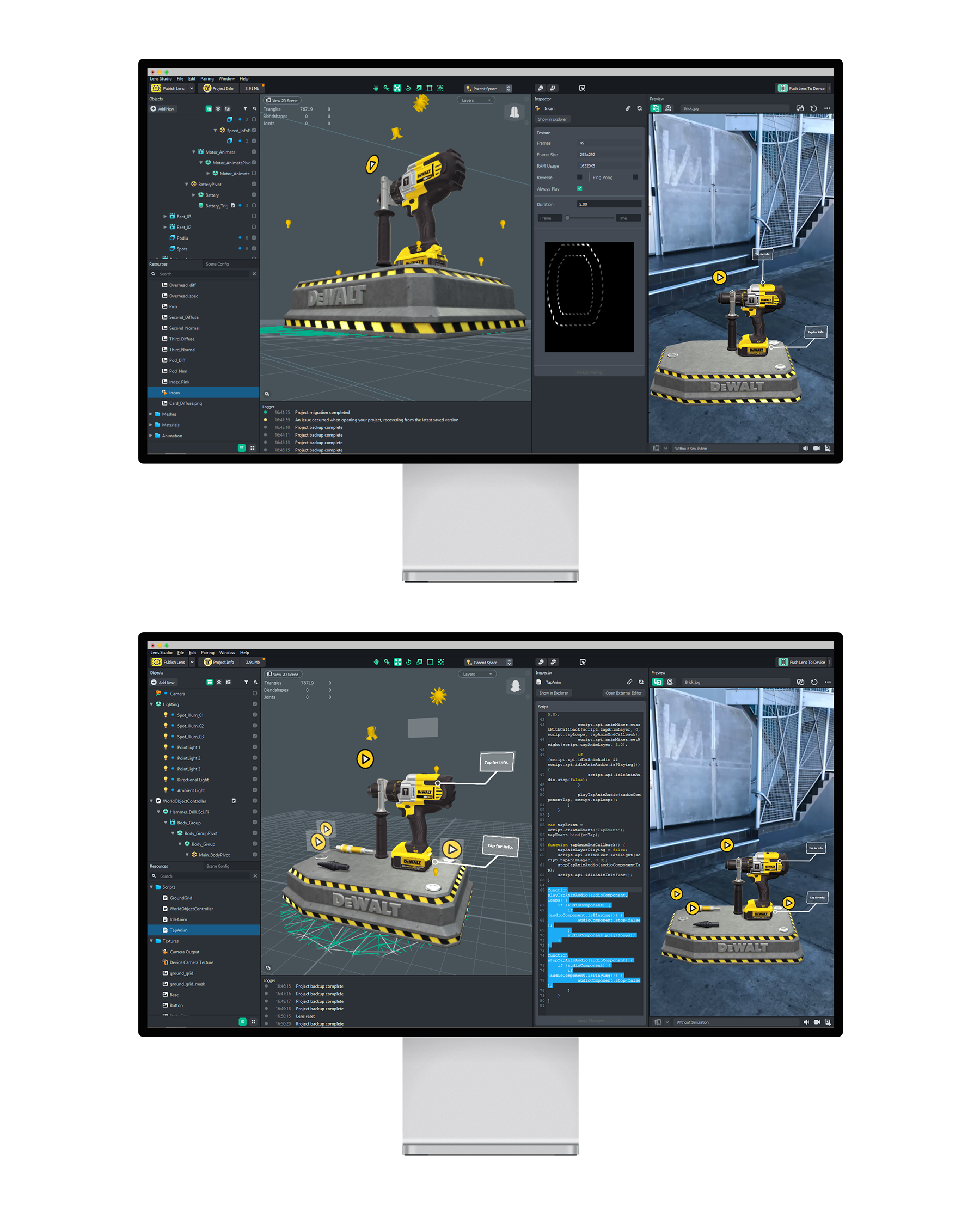
Lens Studio is probably our favourite AR authoring platform right now and maybe we are biased since we are a Lens Creative Partner for Snapchat (that’s a shameless plug right there). But even so, it’s increadeby robust, while still being accessible to artists and creatives with little or no dev skills. Most interactions can be setup using pre-built tools in Lens Studio.

For creating the Button Tap actions, like, a specefic animation(or info card) is triggered by a tap on a button or card  We modified the Touch Collision script to make that happen. Mesh planes were used to create the buttons and we connected the buttons with Script using  Touch colliders. Multiple Animation clips were linked with the individual buttons as well.


Adding in the final content

Overall we tried to build on the pre-existing habits users have while engaging with digital interfaces while trying to integrate the UI elements into the world around us, something that Spatial design strives to do seamlessly.

Going Live!

The final  build of the experience was published as a Community Lens on Snapchat. We specifically chose Snapchat as the platform to build & publish this AR experience was primarily because Lens Studio lets you quickly bash together  assets & content  to test ideas out, without needing to get deep into the tech stack to get something off the ground. After all, this is just another step towards changing the world, one interface design at a time.